
404
One of my pics in this gallery of 404 error pages. [via DeadRobot]
2:43 PM
, # ,
|
Monday, January 26, 2009
Khan: The Opera
1:46 PM
, # ,
|
Sunday, January 25, 2009
40 Factor
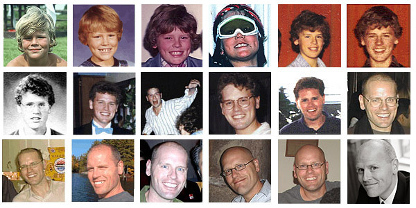
I turned 40 yesterday. Now, if you follow the above photo trend for the next forty years, you'll see all of my hair magically grow back!
12:38 PM
, # ,
|
Friday, January 23, 2009
The Rules
The unspoken rules of graphic design. These are the key ones:
3. The less time you have the more useless your computer will become.
8. If the run is wrong, it's never the press operator's fault.
15. If three designs are shown to a client, your least favorite will be chosen or any combination of worst components of each.
16. If two designs are shown, a third will be requested. If provided, then one of the first two will be chosen.
18. Clients don't have their company logo in a usable print ready format so don't bother asking.
20. The best designs never survive contact with the client.
31. If you purchase new equipment to read your client's disk, it will be the last disk of that type you will ever receive.
32. Your client will often not like your design but not quite know why.
34. A client who knows exactly what he wants is worse than one that has no idea.
37. The customer is always right . And an idiot.
And a couple I take issue with:
11. Proof raeders are useless.
Proofing is what it is ... it's not pleasant and every proofreader I've worked with has always gone far beyond the call of duty.
27. Doctors, astronauts, and plumbers need training to do their jobs, but anyone with a computer is a graphic designer.
Here in Ontario, there's a professional designation for graphic designers: Registered Graphic Designer. All the RGDs I've encountered have been weak designers and for me, RGD has become a badge of mediocrity, embraced by people compensating for a lack of talent. A professional designation for graphic design attempts to parcel off the discipline for the annointed few ... but you can't train talent or passion and even though the practice of design has been elevated recently, in general practice it's not that special. I've worked with lots of people with absolutely no art or graphics training who've had more innate sensitivity for design than all of the RGDs I've encountered.
2:26 PM
, # ,
|
Thursday, January 22, 2009
Life Lessons
Today is the last day of my 30s, and while I could spend the time planning one last trick on Dr. Gideon, instead I'm going to reflect on the life lessons of the past 40 years. And for inspiration, I'm looking to the bright lights of my celebrity contemporaries who are also turning 40 ... and passing judgment on them. Here we go ... Aniston! Aniston is turning 40 this year, wow, she's old! Jen is the one who taught us all that no matter what, it is possible to love again ... wait, no ... she taught us all that it's impossible to love again. If you muck up the one big love of your life, all you have to look forward to is a rebound with Vince Vaughn. Not that there's anything wrong with Vince Vaughn. I loved Vince Vaughn. In Swingers. Fifty years ago. Before he was booked to star in the movie version of that Just For Men commerical. Verdict: Friends was one of the worst sitcoms of all time.
 If there's one thing Kathryn Morris taught us, it's that the police in the past were bumbling idiots. If you pull any cold case off the shelf, you'll find that it's ridiculously easy to solve if you follow the most obvious leads and connect the clearest dots. But not as easy as interrogating a suspect on CSI Miami. Verdict: Please gain 8 pounds and have to dignity to never get a facelift.
 Wilson is turning 40? Wow, everyone's turning 40. Wilson taught us the danger of being an enabler. His great performance in Dead Poet's Society reflected so generously on Robin Williams, it enabled Williams to play the same cliched character over and over and over and then Tom Hanks wanted an Oscar and Steve Martin and Jim Carey and eventually an entire generation of comedians turned into a bunch of sanctimonious bores. Verdict: Jury is still out and will convict if Hugh Laurie does Finding Forrester 2.
 Were we ever so young? Tonya Harding taught us all that it is possible to love again ... and again and again, in a pornographic wedding video. She also taught us that violence is not the answer and that lesson could have spared the US the grief of Iraq if only George Bush had been a figure skating fan instead of a boxing fan. Verdict: No blood for oil!
 You would think that I'd be able to turn 40 in peace, without Friends being on every channel at all hours of the day and night and you would be freakin' wrong. Matt Perry turns 40 having taught us that, given enough time, funny things -- Tom Hanks, Scrubs -- deteriorate into dribbling sap. Except that Chandler was never funny and always wore his neediness on his sleeve and what made the Chandler-Monica thing so sickening was seeing that neediness indulged. Verdict: Almost Heroes.
 Marilyn Manson, welcome to the summer of life! No, I'm kidding, Manson has nothing to teach us, I just couldn't find a decent picture of Jason Kay from Jamiroquai. Kay taught us the most important lesson of all in these times of economic uncertainty ... being hard is not being strong (actually, Duran Duran said that). Verdict: Grunge was fake and stupid.
Anyhow, that's it. One more day before I'm off to the summer of my life. Remember kids, never trust anyone over ninety!
11:22 PM
, # ,
|
Wednesday, January 21, 2009
New Work

11:52 PM
, # ,
|
Monday, January 19, 2009
A Dose of Redesign
EYE WEEKLY used to be a bit of a dumpy runt, but back in 2005 they had a huge win with a major redesign. Over the years, they gradually abandoned that rule book and the paper became sloppier and sloppier and, with last week's redesign, the transition is complete and they're back to ugly.
The new design might make you think DOSE is back from the dead. EYE's content and layout changes have transformed it into a zombie clone of the discontinued print version of the old transit daily. DOSE's design was a little cold, but it was crisp and fresh. EYE's reinterpretation looks like the victim of some mad slasher. The 2005 redesign had a very clear purpose and style; this year's staggers around aimlessly.
Ok, here are a few thoughts about what doesn't work and what really doesn't work:
HEADLINE FONTS - they're horrifying; what were they thinking? The font combinations on the MacLean's redesign -- which was done by a fifth grade student using MS Works -- is easier on the brain. There are two major problems, 1) the rounded font they borrowed from DOSE clashes badly with the other fonts they're using, and 2) Gotham is really overused at the moment, suggesting that it's about to fall out of style. The rounded font is also too mainstream ... go to a Tim Horton's today and you'll see it in use on their video displays.
LINES & DOTS & LINES - There's a mad mix of line styles that, combined with the font disaster, makes the pages look even more like Herb Tarlek's jacket. I thought we were past that mid-decade trend of intentional ugliness.
SUDDENLY FORMAL - So, once you've created a layout that's a wild and crazy mess, what's the next step? Throw in a traditional, formal element! Bylines now appear with a photo of the columnist in a neat, little box. It's a good idea and they're neat and nice but completely at odds with the tone of the pages.
DEATH TO COMIX - Once the cartoonist's friend, EYE's new issue doesn't have a single illustration except for o-che's zodiac characters from istock. NOW has has always been hostile to cartoons and EYE appears to be joining them, leaving Toronto as a city where only the mainstream dailies run cartoons ... how bizarre is that? When you consider the amazing range of comix (Tom the Dancing Bug, Maakies, This Modern World and twenty gazillion more ...) that the US "alt" weeklies nurture, it's ridiculous that neither EYE nor NOW are printing great local work like Dinosaur Comics.
CONTENT CRAP - Instead of some decent comics, we get the "Eyedentical Twins" on the letters page. It's a weak bit from Spy magazine they should have dropped in 1996. From DOSE, they're now giving us graphs and flowcharts which were fresh and funny when DOSE and the internet did them, but it's been done. The circle graph on page 6 doesn't even make sense as a graph. There's no big feature article. There doesn't appear to be a city column ... in fact, any weighty content appears to have been replaced with a navel-gazing column by Kate Carraway. Come on, even Leah MacLaren is tired of Leah MacLaren.
****
We've already been through this. Print suffered a crisis of purpose a couple of decades ago in response to the perceived threat of television. The result was the "USA Today" style of newspaper: more colour, more graphics and shorter, lighter articles. Newspapers are going through another crisis because of the internet and EYE's redesign is looks like contemporary "USA Today" syndrome.
But remember what happened last time ... newspapers didn't die and the USA Today approach turned out to be the wrong direction because people turned to tv for fluff but still turned to print for substance. You might argue that this time, with the internet, it's different. But look around and you'll see signs that it isn't. Over Xmas, my sister showed me a bound, printed version of her house renovation blog. Reading the blog on the computer is a fun way to keep up-to-date, but reading it in physical book form provided a completely different experience ... you can sit, spend time with it and go back to it. Newspapers need to change with the times, but shorter, shallower articles and silly graphics are repeating the mistakes of the past. People are going to still turn to print not just for substance and a more comfortable experience, but to distinguish themselves as people who prefer substance and comfort.
In his note on the redesign (which faces a page and a half of pointless junk that should be the most weighty bits), the editor mentions that "alt" weeklies need to find a new role. "Alt" weeklies are now better described as "culture" weeklies. When you think about it like that, a better recipe for the paper would be a combination of the best of Spacing (strong community connections & smart) and Sally MacKay's old Lola art mag (strong community connections, smart & fun). Lola was especially good at showing that fun and depth are not mutually exclusive. If EYE can crack that, they'll be on to something ... because NOW has never been able to do fun and with Josh Errett as their new "young person" ... they never will.
3:31 PM
, # ,
|
Sunday, January 18, 2009
Rotten Apple
"In fact, an inventory of Apple's remaining DRM armory makes it vividly clear that DRM (backed by the DMCA) is almost always about eliminating legitimate competition, hobbling interoperability, and creating de facto technology monopolies..."
11:19 AM
, # ,
|
Friday, January 16, 2009
The Miracle of the Tim Hortons
Scenes from a Blackout
Our power went out last night right at the end of 30Rock. The disaster preparedness people say that, in the event of a disaster, you need to be able to fend for yourself for at least 72 hours. A blackout provides a nice opportunity to test that out and see if there's anything you need to do ... without having to go for the full three days. We needed more matches, batteries and one of those wind-up radios would have been useful.
And our blackout provided a bonus question: can you last 72 hours ... in -20 degree weather?
I took Zack for a walk first thing in the morning and the Tim Horton's had power but didn't open until after 10am. I bumped into Tony who complained that they were closed all night and said that he'd spent the entire night -- it was -20 -- outside.
Zacks loves the cold and literally flips out in the snow.
CTV's new helicopter was covering the area.
The building that housed the blackout's cause is cleverly disguised to look like an abandoned 1960s housing project. I'm sure the view of this structure from a news helicopter is simply spectacular!
Dufferin and Bloor was crowded with people trying to get to and from work. Our power returned sometime around mid-afternoon.
4:32 PM
, # ,
|
Thursday, January 15, 2009
Birth of a Brand
 I love RBC's current ad campaign. I love the artwork and I love that they're using cartoon characters ... and after leafing through the current issue of Strategy magazine, I especially love that it was my idea.
Ever since the campaign began, I've been wondering if it was related to my work, since the character styles seem similar to cartoons I've been drawing for the bank since 2004. According to the Strategy article, the current campaign "evolved" from that stuff.
The first time I pitched a (rejected) cartoon to RBC was way back in 2001. I mocked up an illustrated version of their lion mascot for a colleague's web project. I wasn't illustrating much back then, so I'd try to squeeze cartoons into any project I could.
But RBC cartoons didn't happen until the start of 2004 when I worked as a designer with Benchmark on an internal RBC project. Originally, cartoons weren't even on the table. Instead, the design was going to use cut-out stock photos of people. As usual, I wanted to do cartoons and and this seemed like a project where they might fit so I pitched a cartoon option. There were legitimate concerns that cartoons would seem 'childish' and 'not serious' but the point of the project was to break from the past and cartoons seemed like a good way to do that and engage people in a friendly manner. To get past objections, I described the artwork as "New Yorker-styled" cartoons for adults, not Saturday morning cartoons for kids. I threw around that "New Yorker" reference everywhere I could.
My big regret from my time at Hot Docs was that I was never able to get past the 'childish' objections to cartoons and push through an illustrated campaign, which would have been more appropriate there than at the bank! The closest I came was the bland papier mache globe artwork which failed because the earliest drafts (which featured a full diorama with the sky and clouds, etc.) were rejected as being too 'childish'-looking and I never managed to come up with an equivalent "New Yorker-styled" defense.
Anyhow, back to the bank. We received the go-ahead to try some cartoons to see what might be possible while continuing with the photo cut-outs so we'd have something to fall back when the cartoons flopped. But the cartoons didn't flop. The early roughs of the cartoons looked promising compared to the photos, so we moved ahead:
And developed them:
 At that time I was still doing my newspaper cartoons in ink on paper and had no idea how to draw on computer with a tablet. So, as I was developing the drafts, I was also relearning how to draw (which is partly why I kept the characters simple).
When the initial brochure appeared, people liked the cartoon approach and more cartoons were drawn for internal posters, training manuals and later, even animated characters for videos and computer training programs. I've done a few sets of cartoons for the bank every year ever since, even though the original project ended a few years back. As my computer drawing skills improved, newer characters strayed from the simplicity of the earlier drawings as you can see from this construction worker, created last month. The ad campaign has reminded me that the simplicity of the earlier characters actually works better than the newer stuff.
Banks ads usually feature photos of happy, pretty people walking into bank branches and buying houses and cars. When you compare the RBC ads to any other bank creative, you can really see that they've gone out on a limb with the cartoons. Creative types live to do the kind of work you see in those ads, but companies -- especially banks! -- rarely give you the opportunity to do something really different and fun. And they're not just cartoons, they pulled out all the stops in amazing pieces like this muffin commercial:
Ummm .... ok, except it doesn't happen that way in real life. In real life, the little muffin businessman plunks along uncredited while a big ad agency revises his recipe and cashes in. And then the muffin man briefly toots his own horn on a post on his blog ... but if he's lucky, he has recipes for more than just muffins.
1:24 PM
, # ,
|
Thursday, January 08, 2009
I Gotta Bad Case of Lovin' (Bad) Reviews
This afternoon, while I was out getting dog food, I saw the new issue of NOW sitting on the stands and the cover announced that Norman Wilner was going to take on his critics and I thought, "It's on!" Get ready for a scrap!
Last month, Wilner gave Toronto Stories a lousy, single "N" review. This prompted reactions on the NOW website accusing Wilner of being 'too harsh' and not supportive of the local film industry in comments like this:
Every movie that gets made, every last one, is a little miracle, and that should at least be celebrated, seeing as our local "industry" is a pale shadow of what it could be, thanks to 'critics' like this.
I did a little work on that movie (right back to the cover art for the funding proposal) and while I think Wilner's review is off, I also disagree with some sentiments in the comments. I don't think that local critics 'support' local work by soft-peddling their reviews. Every last local film is not a little miracle -- images from Bon Cop, Bad Cop aren't about to start appearing on pieces of toast -- and the best way for local critics to support local work is by doing their job and being critical. The problem with Wilner's review is not that it's harsh, it's that it's not really a critical review.
I love mean reviews (not so much when they're directed at me), from the old PC Gamer reviews of terrible video games to the X-Entertainment reviews of Corey Haim videos. I discovered harsh reviews one day as a kid while leafing through an issue of People while waiting at the doctor's office to have a case of poison ivy corrected. Inside the issue were short reviews of movies, tv and music and the meanest reviews were the funniest. A few years later I got the same buzz reading William Goldman's Adventures in the Screen Trade. Near the end of the book, George Roy Hill tears into a short script Goldman created as an example and Hill is funny and harsh ... but not personal. He's being critical but it's in the service of the work. I once had a TA who would declare over and over, "being critical is not an anti-social activity."
Reviews of bad movies give the reviewer an opportunity to have some fun and that disappointed me about Wilner's review: it's not harsh, it's feeble. He lists the actors, he lists the directors, he says they suck. Yawn. If you go and read more of Wilner's reviews, you find that they're all laundry lists. There's no passion for exploring anything beyond some particulars that he declares either good or bad. Instead of simply pronoucing judgement on cast & crew, a decent Toronto Stories single 'N' review would spend at least one paragraph trying to get at one core reason why the critic thinks the movie doesn't work ... and one paragraph on mean jokes.
So, back to today's issue ... I reckoned that Wilner was going to hit back and hit back hard. Okay Wilner ... STRIKE:
As for the idea that I – or this newspaper – should champion alternative local film just because it’s alternative and local, well, we’re going to run into some problems there. I’m a movie critic, not a publicist; when a movie is good, I’ll say so, and when a movie sucks, well, I have to say that, too.
And you know what the job of a poo snooper is? THEY SNOOP FOR POOP. Given the opportunity to make an intelligent point about the role of the critic, that's all Wilner could come up with. No mention of his role being anything beyond declaring something either "good or "bad". What's sad is that Wilner doesn't imagine himself as part of a process to make better Canadian films and that's a shame, because that's a stand he could have taken in his column. Instead, he spends eight paragraphs poop snooping around the fact that he views being critical as an anti-social activity.
You could make a good case (but nobody did ... except for me, right now) for local critics to be a little gentler on Canadian films. The movies that arrive here from other countries do not represent the full range of films that are produced worldwide. Other countries produce a lot of crap that never ends up here ... so local films usually end up competing against the best from other countries and our expectations are shaped by that. We think Canadian films 'suck' because we only measure them against the world's best.
Of course, I wouldn't argue that, it's stupid. Wilner's critics' energy would be better spent railing against the things that do conspire to make Canadian films mediocre such as the wet blankets government and corporate funding groups pile on top of filmmakers and the tendency to ape Hollywood conventions that results in crap like Bon Cop, Bad Cop (the most conventially-American Canadian film ever made) and Passchendaele. And Wilner could give them the ammo by examining what's wrong with films instead of just pronouncing "good", "bad", "good", "bad", "good", "bad" ...
5:14 PM
, # ,
|
Tuesday, January 06, 2009
New Work: Fake Boobs

12:01 AM
, # ,
|
Monday, January 05, 2009
Grey Skies Are Gonna Clear Up!
If you're feeling blah because it's Monday and the holidays are over, the blog Sadly, No! has been engaging in some shenanigans that should put zip back into your zingaroo.
Last month the conservative blog, Gay Patriot -- a blog for gay people who have never been to this or any other planet named Earth -- launched a poll to determine the "Grande Conservative Blogress Diva 2009". Obviously, it was also posted to the 'Starbucks Patriot' blog.
And they would have got away with it too, if it weren't for those damn kids. Sadly, No! decided to throw their weight behind an ol' fan favourite: So, it's up to us SadlyNauts to bring a little oomph to the Tres Grande Conservative Ogress 2009 competition. And the best way to do that is to go over there and vote en masse for Kathy Shaidle, aka Five Feet of Fury Four Feet Six Inches of Stupid. The best reason for voting for Shaidle is that Bruce and Dan do not seem to have stumbled upon the delicious irony of Gay "Patriots" giving a best blogger award to a foreigner. That alone is reason to give the lavender, white and blue ribbon to Shaidle. But there’s more -- the vile pint-sized racist is a raging homophobe too.
So, when Shaidle pulled WAY ahead on the poll, the Gay Patriots yanked her from the poll, stating that she'd asked to be removed. Sadly, No! responded by endorsing another candidate who, again, raced to a staggering lead:
Behind the real Blogress of 2009, the second favorite was Pamela "Atlas Shrieks" Geller. If we give her 2,000 votes, perhaps Bruce and Dan will dish out to her the same fate they dished out to poor Ms. Shaidle. So vote for Pam as often as you can. Do it for justice. Do it for Kathy!
The end result? The most idiotic celebration of a whacked poll ever. Congratulations, Venti Conservative Non-Dairy Bloggucinno 2009!
12:39 AM
, # ,
|
Saturday, January 03, 2009
You Love Alanis
So spend your Saturday watching her cheese. [youtube, embed not allowed] And this one has some bad actor in it ...
1:18 AM
, # ,
|
Friday, January 02, 2009
It's gonna be an interesting winter ...
2:48 PM
, # ,
|
Thursday, January 01, 2009
New Year, New Sandwich
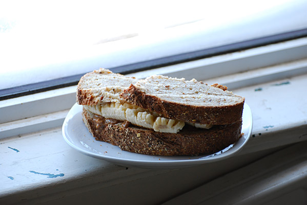
Look at that sandwich. What a way to kick off 2009 ...
10:25 PM
, # ,
|


Contact
info[at]brettlamb[dot]com
My Cartoon Archives
HAPPY CREATURE
MS. JOHNSON
ED LOCKE
Regular reads
Accordion Guy
Bill Doskoch
Daily Dose
Davezilla
Tony Pierce
Warren Kinsella
News
BlogTO
boingboing
Cursor
DIGG
Dork Shelf
Drawn!
FoodForethought
Fleshbot
Garlicster
Global Nerdy
MetaFilter
Mondoville
The Oil Drum
Reddit
The Register
Slashdot
Space.com
Spacing Wire
Torontoist
Treehugger
ZDNet
Arts & comics
Children of the Atom
Chromewaves
Comic Strip
Corrigan
DeadThingsonSticks
Dinosaur Comics
Hollywood North Report
Maakies
MacKay
Sally McKay
Secret Lair
Toronto Comic Jam
Zoilus
Audio
The Bugle
Coverville
Radio Clash
Ramdom Thoughts
Video Toronto blogs Canadian blogs USA blogs Oz blogs UK
Channel101
Circadian Shift
Consolation Champs
Crazy Biker Chick
Day in the Life
Dead Robot
Easternblot
estrojenn
Exhausticated
Free Clara
JB Warehouse & EmporiumLiz Vang
Luminescent
Marmalade
Merv
Naked KnitGirl
Photojunkie
Pony
Pshaw
Raymi the Minx
Robot Johnny
Searching for Tao
Secret Storm
Squiddity
TBIT
Simple Spendor
Sooey
Confessions of a Monkey
Dust My Broom
Grrl Meets World
Ian King
James Bow
Simple Spendor
Sooey
View from up here
Cityrag
democraticSPACE
Dooce
Explananda
Fred the Blog
Jett Superior
Maakies
MegaBeth
Panopticist
Yoon Choi
Brett Lamb: OZ
Little Lioness
Penguin Says Yes
B3TA
Rathergood
![]()
Create Your Badge
www.flickr.com
|
A R C H I V E S
2009
JANUARY
2008
JANUARY
FEBRUARY
MARCH
APRIL
MAY
JUNE
JULY
AUGUST
SEPTEMBER
OCTOBER
NOVEMBER
DECEMBER
2007
JANUARY
FEBRUARY
MARCH
APRIL
MAY
JUNE
JULY
AUGUST
SEPTEMBER
OCTOBER
NOVEMBER
DECEMBER
2006
JANUARY - 1
JANUARY - 2
FEBRUARY
MARCH
APRIL
MAY
JUNE
JULY
AUGUST
SEPTEMBER
OCTOBER
NOVEMBER
DECEMBER
APRIL
MAY
JUNE
JULY
AUGUST
2005
JANUARY
FEBRUARY
MARCH
APRIL
MAY
JUNE
JULY
AUGUST
SEPTEMBER
OCTOBER
NOVEMBER
DECEMBER
2004
MAY
JUNE
JULY
AUGUST
SEPTEMBER
OCTOBER
NOVEMBER
DECEMBER
[ 2003 ] [ 2002 ]
View My Stats